We’re still Kids in the Game, we just got new uniforms.
Today, we are launching our rebrand, which marks the beginning of a refreshed look. At Kids in the Game, we love where we’ve been, which makes us even more excited for the future.
So, why did we do this?
Our goal in rebranding was to ensure everything (yes, we mean everything) aligns our visuals and voice with the heart of Kids in the Game. We are coaches, youth development experts, and we are passionate about what we do.
We believe a brand goes further than simply selling a product; it seeps into lifestyle, feelings, and emotions. As we continue to grow, we want to ensure everyone we work with understands that we do more than just help during recess, after school, and run summer camps. An overarching brand and identity helps us effectively communicate that.
An important aspect of being a brand is that people recognize you in the wild. Before now, people saw a whole lot of different things.
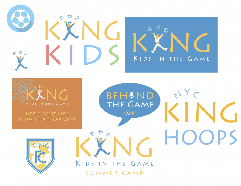
These are all excellent, but we realized we were missing consistency and alignment. So we brought in the experts.
Over the past nine months, we have been working hand in hand with a group called Visual Soldiers out of Atlanta. After getting to know us, observing our programs, and meeting our staff, they helped us define and express exactly who we are and what we do. And so it begins, our new brand rollout.
What’s the same, but different?
Our mission.
We moved from this: To positively change the way NYC youth are growing up by developing healthy habits, an active lifestyle, and promoting personal growth through sports, creative movement, and play.
To this: To provide positive experiences and opportunities through sports and creative play.
Clearer. More concise. Yet we believe it still embodies everything stated in our original mission. This communicates a clearer message for our families to understand Kids in the Game, and ultimately want to engage with us.
We’ve seen the effects of a child participating in sports and physical activity; we know the positive impact. These are the tools we use to develop emotional intelligence of youth and foster a positive sense of self. So every day we’re asking ourselves, “How can we better serve your kids?”
This refreshed mission helps us accomplish our vision and our purpose as well. These elements haven’t changed, but we want to be clearer and more consistent across all of our programs.
Our Vision: To encourage active lifestyles and character-building, to develop the integrity of a generation.
Our Purpose: To be an innovative facilitator for sports-based youth development.
Now, what exactly will change?
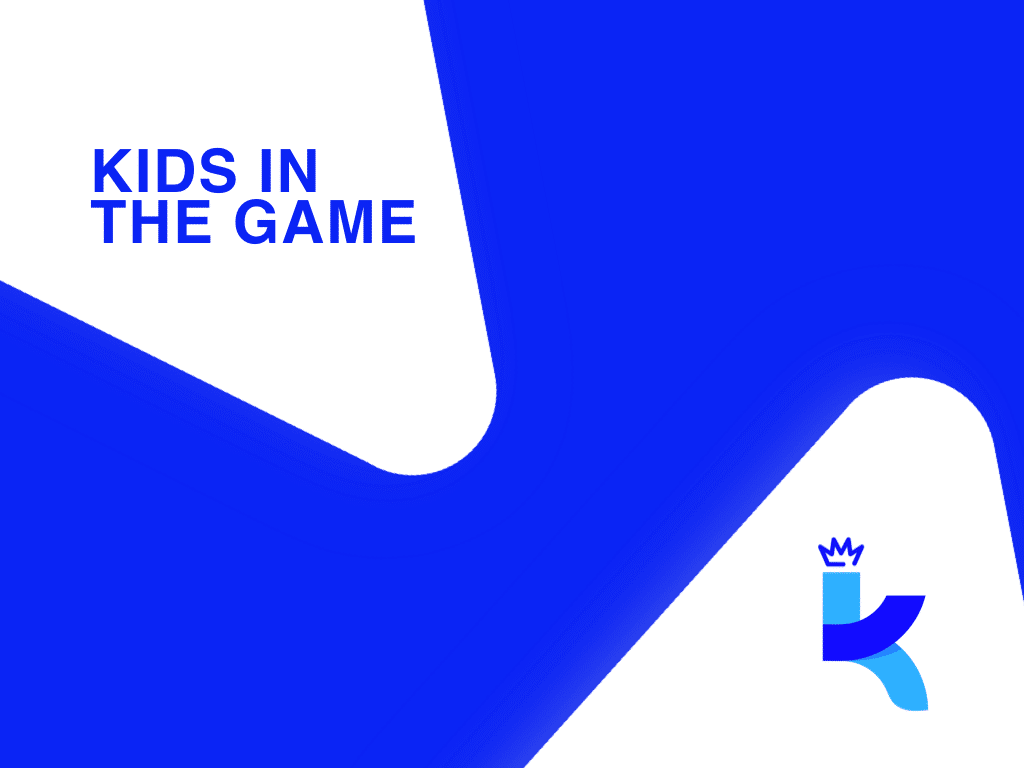
Our colors, our logo, our gear, our look.
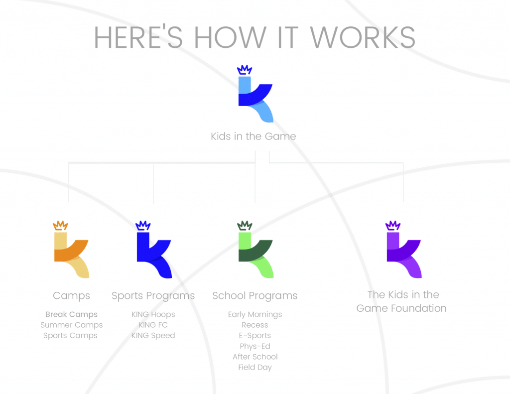
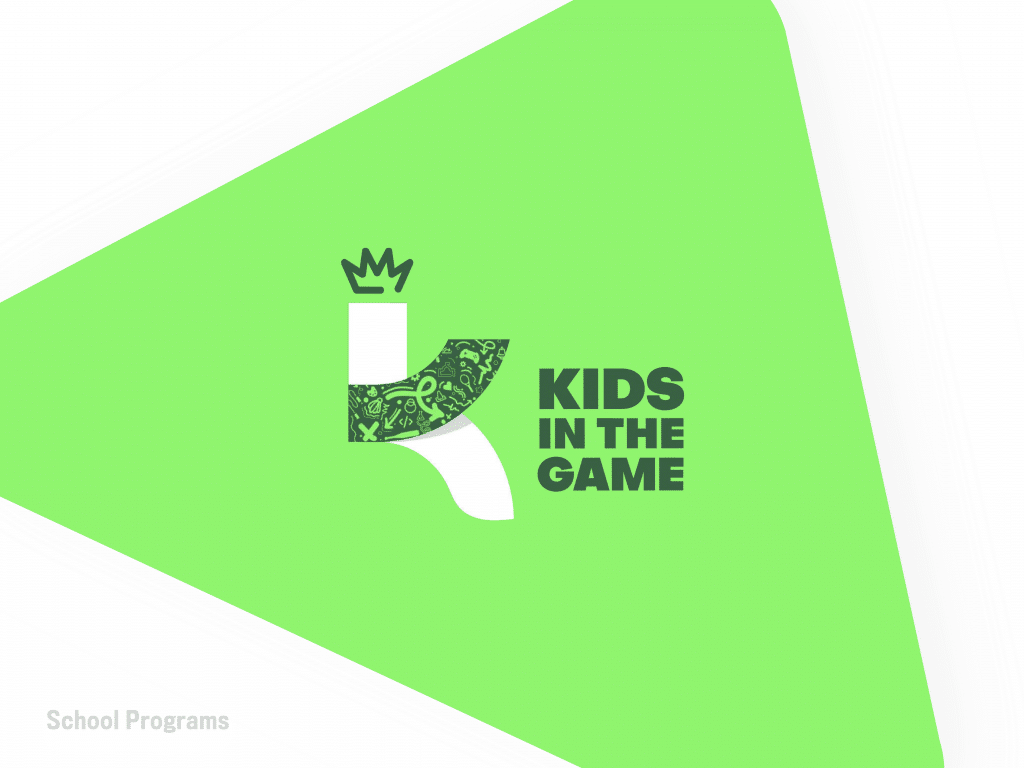
We keep using the term “brand umbrella.” Hopefully this visual will give you a better understanding of what that means. Our overhead brand is Kids in the Game, with four direct sub-brands in our camps, sports programs, school programs, and the Kids in the Game Foundation. You’ll see a lot of these colors when we talk about these individual programs.
The Design Behind Our Logo
Through our new logo, we want to highlight a few things. This logo can be dressed up to be fun, energetic, and dynamic. It can also be dressed down to be simple, clean, and professional.
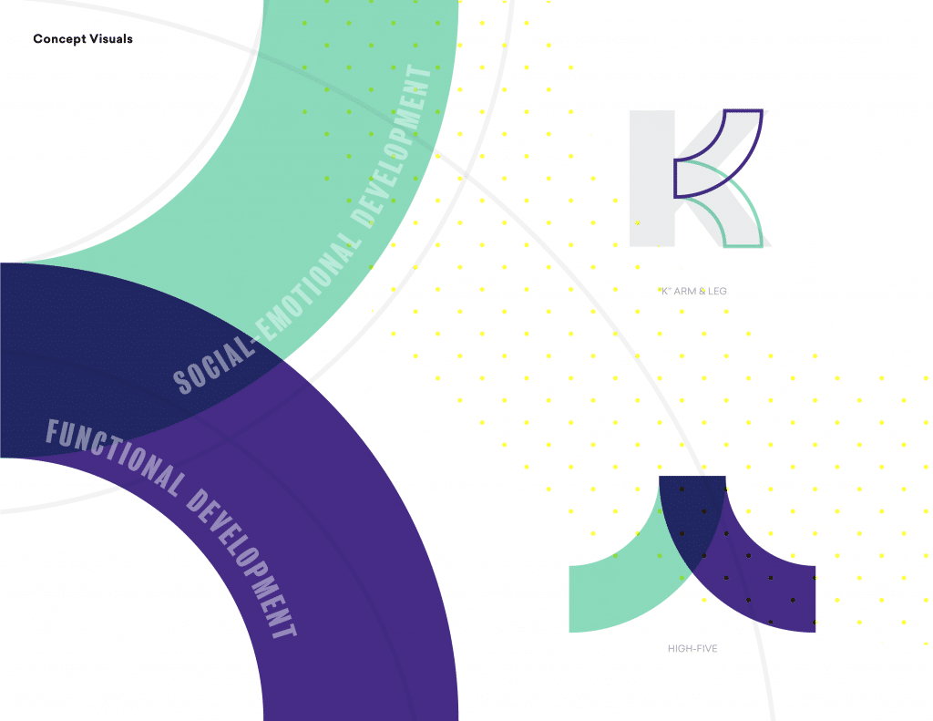
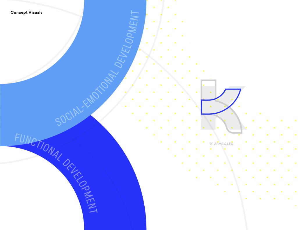
This concept has evolved to be a dynamic abstraction of the letter ‘k’ that focuses on the overlap of functional and social-emotional development. A mix of sharp and rounded elements captures both the competitive and caring sides of Kids in the Game. Our brand is simple in nature, but allows room for play and experimentation, much like our staff and programming.
To highlight the intersection of sports and creativity, our logo focuses on connecting two shapes. It represents the well-rounded yet dynamic aspects of Kids in the Game.
The Play Shape
This concept utilizes a simple yet effective visual cue, the play shape. It is derived from the iconic call-to-action that is the play button. This graphic can be used in creative ways throughout the brand, adding interest and depth to our visuals.
The Legacy Character
To keep part of the tradition of the Kids in the Game brand, the character from the old logo has been updated and restyled. Legacy is a small, helpful, personified graphic element that acts as an information channel.

The Curved Lines
Set in the background of our materials, the curved lines represent trails of play at recess or in a sports game. The lines are similar to the markings on a basketball, tennis ball, baseball, or the three-point arc on a basketball court, and they add a dynamic element of motion and depth to our branding.
In Conclusion
Overall, this new look represents our commitment to the future of youth sports development in New York City. So far, we’ve reached over 25,000 kids in all five boroughs, and we’re just getting started. Our heart and what we are trying to accomplish on a daily basis is staying the same.